Kitchen for Sale!
I gave away a kid’s play kitchen on Craigslist recently.
I posted it, got a message almost right away, and fifteen minutes later a woman pulled up in a truck. We carried it out together, slid it into the bed, and she drove off.
That was the entire experience.
I couldn’t help thinking how easy the transaction was from start to finish. From posting to pick up, it worked exactly the way I hoped it would.
Where’s the design team?
Imagine you run a business that:
operates in more than 70 countries,
generates hundreds of millions in revenue,
plays a role in billions of dollars of economic activity,
ranks among the most visited sites in the world, and
has extremely high brand recognition.
Now imagine that the way people experience your product looks like this:

The website hasn’t changed much over the years.
Plain text. Blue links. A simple layout.
Those design choices didn’t happen by accident.
Craigslist started in the mid-1990s as a simple email list. Craig Newmark was sharing local events, job postings, apartments, and items for sale with friends in San Francisco. As the list grew, email stopped working and it moved to a basic webpage.
Over time, users kept asking for the same things: speed and ease.
The site stayed close to what worked. Categories and reach expanded. The look and feel stayed familiar.
When someone opens the page, they know what they’re looking at. They know what to do. They get what they came for.
Contrast that with how the broader web operates today.
There are more than 1.2 billion websites online, with roughly 200 million considered active. At the same time, the web design and services market has grown into a massive global industry. Companies spend tens of billions of dollars every year on design, user experience, and digital presence.
There are countless tools and templates that let almost anyone build a modern website. Platforms like Webflow, Wix, Squarespace, and WordPress (heck, even Beehiiv!) make it easy to create something visually polished, interactive, and responsive.
Canva’s entire business is based on convincing you not to look like Craigslist.
OMG! That’s our website?
No founder, CEO, or Marketing Chief would suggest launching a company website or app today in the plain-text style of Craigslist. The expectation is branding, layout, interactivity, mobile optimization, and metrics tied to engagement and conversion.
Sizzle!
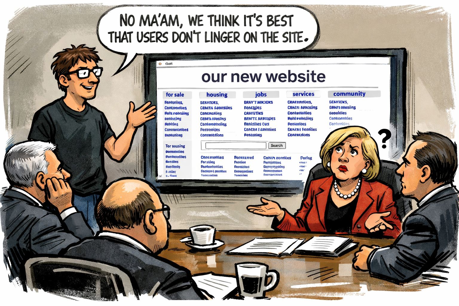
Can you image the fortitude it would take to pitch the Craigslist-like design to the Board?
And yet, Craigslist continues to work.
In an environment where companies spend heavily on websites designed to hold attention and influence, Craigslist lets people finish what they came to do.
You search. You find. You act. You leave.
Most websites today aim to be destinations. They want you to stay. To engage.
We want it too. Scroll, baby, scroll.
Craigslist lets you get in, get out, and move on. No pop-ups. No notifications.
Contrast this with Facebook Marketplace, where to access the site, one has to do something incredible painful…log onto Facebook.

We listened to our customers, no really, we did
You can bet your bottom dollar that once upon a time there proposal for an updated design of the Craigslist site. Something with a java plug-in, or an explainer video about how cool it is to buy a slightly discolored couch.
But Craigslist decided early on to trust their customer. The feedback was that the site is easy to use. Remember, this was an email-based business.
Web 1.0 was the upgrade.
People seem to want less complexity. They seek comfort. They want a way to get something done and go about their day.
I suppose this is why wearing pajama pants in public is so prevalent today.
Yet the simplicity shows up in how people use the site. Someone needs a coffee table. Someone needs a tenant.
Someone wants to give away a play kitchen.
The tool supports the interaction and then wipes its hands of it.
The clarity and directness of the site is the brand.
That’s what made the play kitchen exchange feel so simple. I “learned” Craigslist years ago and still know exactly how to use it. There were no decisions about navigation or layout. The path from post to result was short.
The Takeaway
This raises a useful product question: how much of what we build today makes decisions harder rather than easier?
In many areas of work, features get added with good intentions. I’m a product guy, guilty as charged.
Dashboards, alerts, analytics, onboarding flows, interactive experiences. Over time, simple actions can start to feel heavy.
When a product becomes harder to operate than the problem it’s meant to solve, people stop using it. A smart product can make the user feel dumb.
Craigslist shows what can happen when complexity stays low. When there’s little to no friction, albeit light on frills.
People return month after month, year after year, because it helps them do what they came to do without extra steps.
Stay in touch
If you enjoyed this piece, please reach out, I’d love to hear from you.
You can contact me at [email protected] or LinkedIn.
Stay safe out there!


